CCPA issues guidelines for prevention and regulation of Dark Patterns: Basics Explained

On November 30 the Central Consumer Protection Authority (CCPA) issued a gazette notification “Guidelines for prevention and regulation of dark patterns“. The objective of the government is to protect consumers’ interest and has banned use of “dark patterns” on e-commerce platforms which intend to deceive customers or manipulate their choices. Its application will be to all platforms offering goods and services in India, and even advertisers and sellers.
Use of dark patterns will amount to misleading advertisement or unfair trade practice or violation of consumer rights. The penalty will be imposed as per the provisions of the Consumer Protection Act.
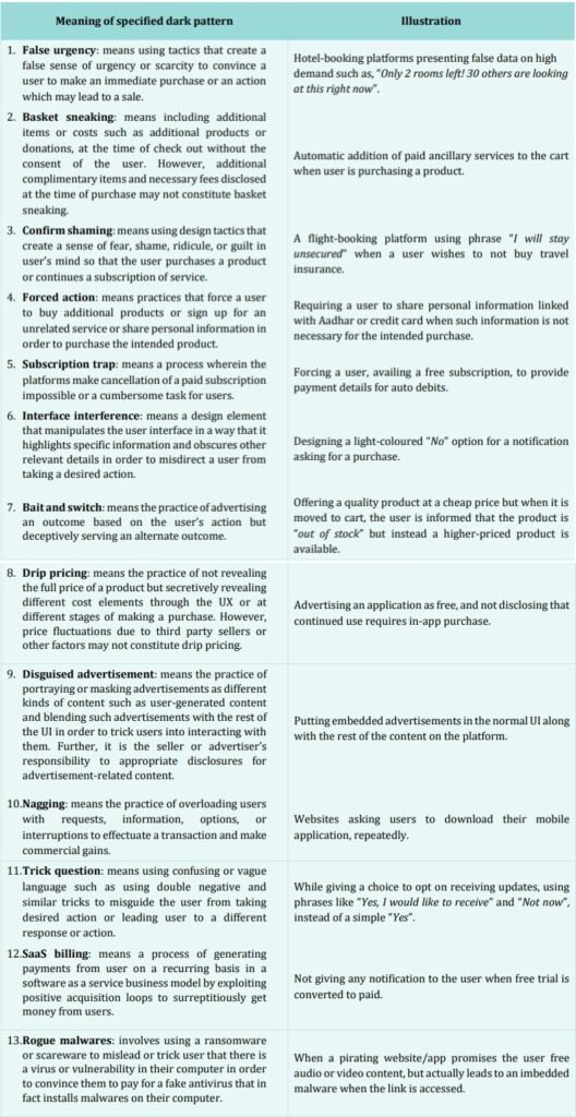
According to the notification, dark patterns have been defined as any practice or deceptive design pattern using user interface or user experience interactions on any platform that is designed to mislead or trick users to do something they originally did not intend or want to do, by subverting or impairing the consumer autonomy, decision making or choice.
LEARNING FROM HOME/ WITHOUT CLASSES/ BASICS
Dark patterns—also known as deceptive design patterns—are interfaces designed to subtly trick Internet users into doing a task you otherwise normally wouldn’t do.
They’re strategies for misleading or tricking Internet users into doing something they don’t want to do. The user experience (UX) designer Dr. Harry Brignull coined the term “dark patterns” in 2010. As he explained, most people “don’t read every word on every page—you skim.” Some companies take advantage of this. They purposefully design pages to trick
users.
It has far-reaching consequences. There are the dangers of lost money or privacy, of course. But many people also point to dark patterns as a cause for the spread of fake news.
Forced continuity: This is a common tactic that happens to most people. A company offers a free trial to a subscription service, but you must provide your credit/debit card information. After your free trial ends, the company continues to bill you.
Roach motel: In this circumstance, companies make signing up for a service—usually a subscription service—incredibly easy, but the process of leaving is difficult and confusing.
Misdirection: Companies will lead users into committing a task that’s of the company’s interest to deter users from another action. One way companies accomplish this is by making the “Buy” button larger than the “Not buy” button if a company wants you to purchase a programme.
Bait and switch — The interface appears to do one thing, but it actually does something else. A classic example of this is when a popup has an X button in the corner, but when you click it, it actually brings you to a website instead of closing the popup.


0 Comments